
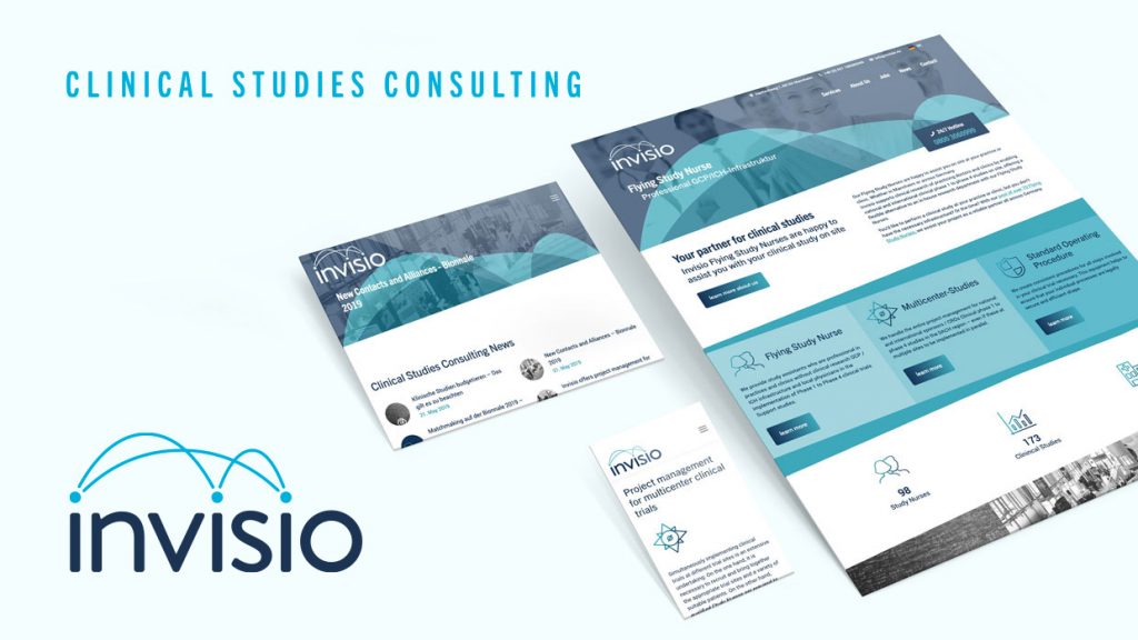
Invisio Clinical Studies Consulting UG is kicking off the second half of the year with a new look. “To create a uniform brand presence, we have had our entire corporate identity revised,” says Florian Schnabel. “Invisio has made clear developments in many areas over the past eight years, and we would like to also visually depict this process.” One example of this is the newly conceived word/image logo: Moving forward, the motif of the stylized Flying Study Nurse will be done away with. Arched lines above the Invisio lettering dynamically connect the “i” dots of the company name with one another, thereby forming what looks like a roof. “The lines represent our networked way of working and symbolize highly sought-after services such as project management for multicenter studies (i.e. studies controlled by us) which are simultaneously implemented at various locations,” explains the CEO. The previous color scheme of dark blue, turquoise, and white will remain as is.
Fresh Look, New Features
The revised corporate identity is also reflected on the Invisio website. In addition to various design adaptations, the layout of the homepage has also changed. For example, the News section has recently been moved to a more prominent position and displays a featured image. Invisio has also upgraded the website in a technical sense: In the coming weeks, a live chat function will be installed to serve as yet another communication channel. Both customers and prospective customers can use it to ask questions and then quickly receive all the information and help they need. Among the new features is also a French language option that will be completed soon. “The French-speaking market is becoming increasingly important for us, so we want to give this development the attention it deserves,” explains Schnabel.

